5 Elements of Composition for Better Photos
Everyone is a photographer these days because we all walk around with cameras at all times by default. Therefore, it is an art form we can all partake in. I am going to break down 5 elements of composition for better photos plus a couple bonus tip.
Rule of Thirds
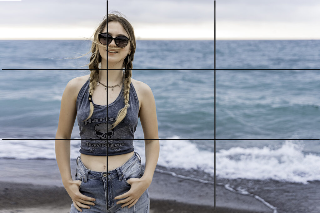
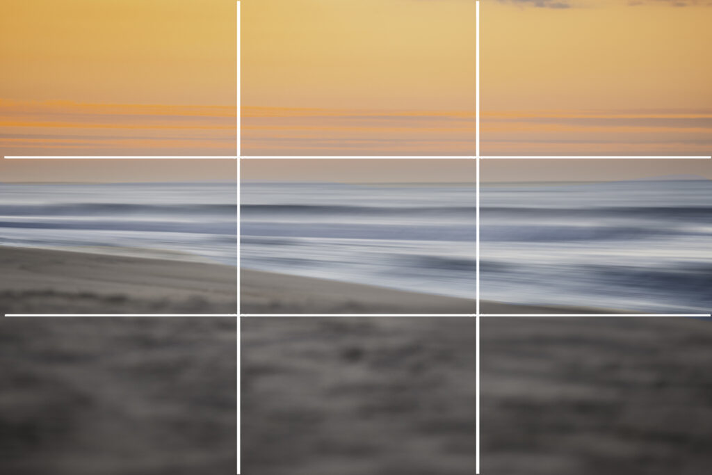
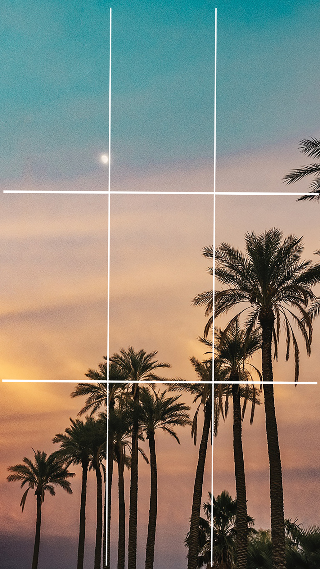
The first element of composition for better photos is the Rule of Thirds. Interestingly, the rule of thirds has been around well before photography was a thing used by painters as far back as the 1700s. It refers to horizontal and vertical guidelines in your viewfinder. Thus your image is split into three sections up and down as well as from side to side creating nine equal rectangles. What this does is allow you to deliberately compose your image according to the guidelines creating a more visually appealing photograph.
Without a doubt, once you start looking at the world through the rules of the third frame, you will see it everywhere. Next time you watch a movie or your favorite Netflix show, pay attention to how often it is used in the cinematography. Or if you find yourself in a museum, it will appear in all art forms.
Here are a few examples to further explain.

Framing
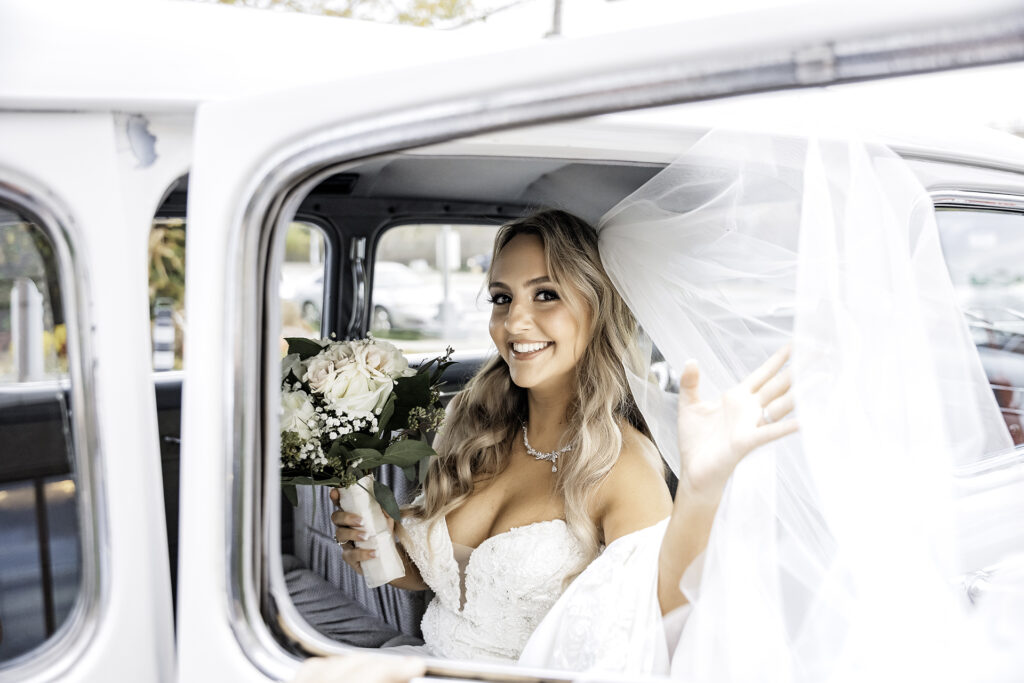
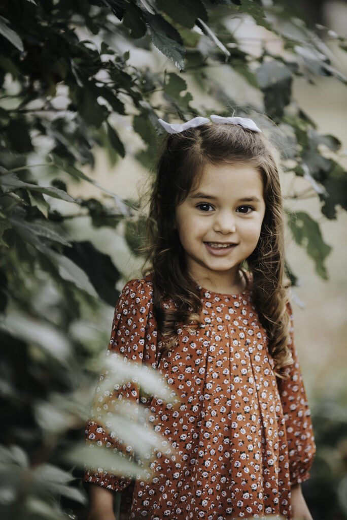
Another element of composition is framing. You can get really creative with this one. It’s so much fun to seek out ways to frame your subject. The possibilities are endless. Framing is pretty much exactly what it sounds like. Frame your subject within another element in the scene to draw attention to your subject. Frames can be anything. Doorways, windows, alleyways, trees, and even things like shadows and pockets of light all can be used to frame a subject. For example, I like to sit a little kid between their parents and use the parents’ legs to frame the kid. It’s so cute!
Once you start looking for frames, you will be surprised at what you will find to use in your image. As always, it is best to show you what I mean. So here are a few examples of framing as a composition tool.


Leading Lines
As we continue, the next element of composition is Leading Lines. Again, this is exactly what it sounds like. You want to find naturally occurring lines in your scene that can lead you to your subject. Typically you would place your subject a the end of or along the lines. This guides the viewer’s eyes to your subject and creates an aesthetically pleasing image in the process.
I’m sure you have seen photos of a person standing on the gold lines of an empty road. Those gold lines act as leading lines to your subject. Other leading line elements could be a hallway, bench, fence, stairs and so much more. It really is a matter of taking a good look at what is around to see what is available to you.
Check out these examples to get your creative juices flowing.



Negative Space
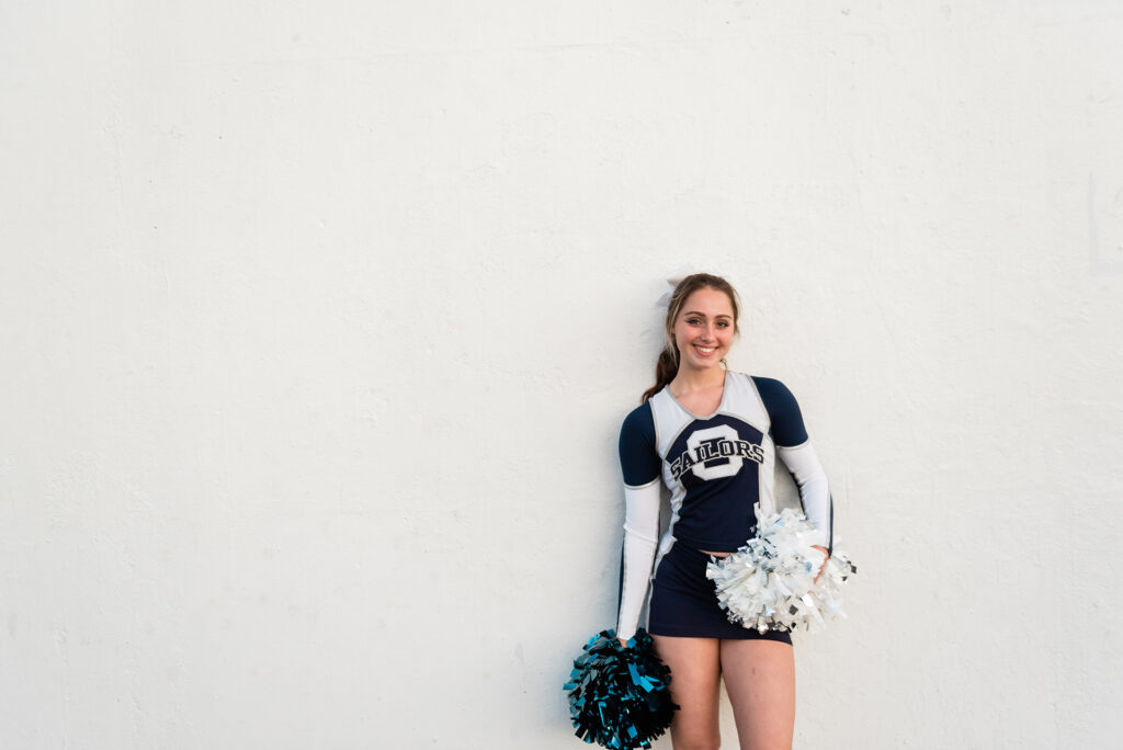
At this point, we are onto slightly more nuanced elements of composition. Let’s talk about negative space. To clarify, negative space is essentially empty or undefined space. In order to isolate his or her subject, the photographer will use a large swath of negative space. Like many of the other elements, this brings the viewer’s attention to the subject. In like manner, examples of negative space might be the sky, a solid color wall, fog, water, snow, or a single-colored blurred background.
Indeed, when used well, negative space can create a dramatic or haunting feel to an image. It’s particularly effective in wide shots that show a lot of the scene. While there are definitely exceptions, nature is often a major factor.
As a demonstration, I have for you examples of the use of negative space. Once you see it in action, it makes total sense.


Symmetry
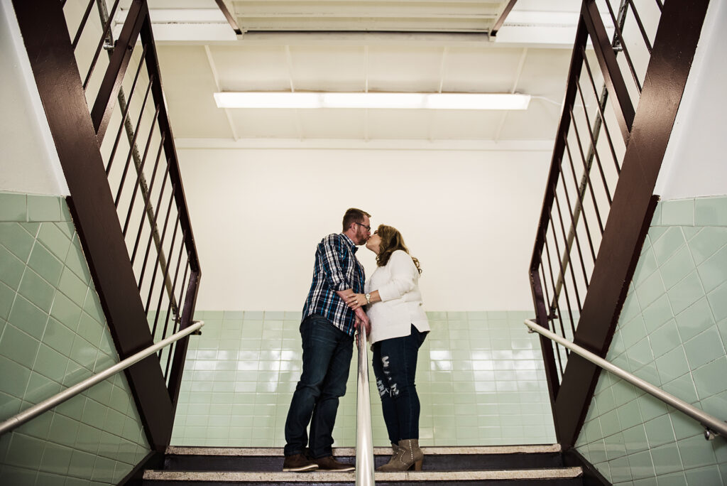
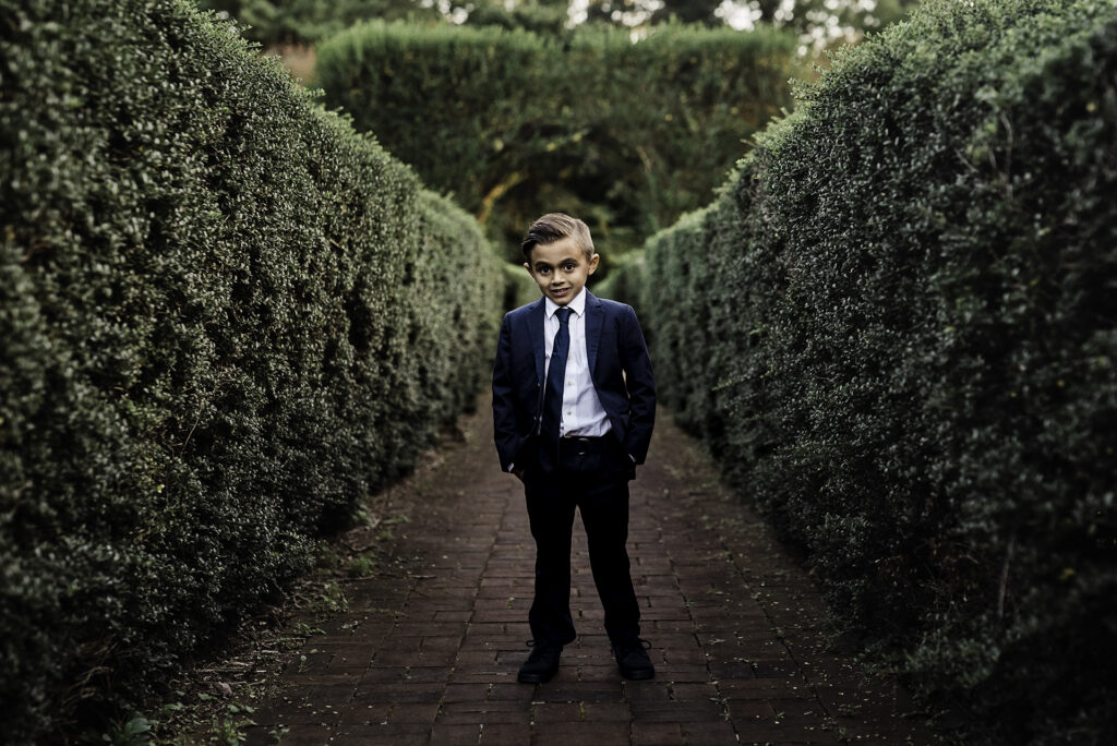
Symmetry is an element of composition that we tend towards naturally. In this case, imagine taking your scene and folding it in half. Each half should be identical and in some cases nearly identical. And even though it’s an almost obvious choice to place our subject in the middle of the frame with each side mirroring the other, it’s still quite effective in creating a visually stunning image. It’s also super effective at drawing attention to the subject.
Learn about the types of symmetry here. In the meantime, check out these examples.

In conclusion
Altogether, you have a handful of tools that you can start to apply to your photographs to take them to the next level. Next time you head out with your camera, look for ways to incorporate the rule of thirds, leading lines, framing, negative space, and symmetry. You will find that they work together really well and using more than one is a great idea. Have fun with it! And feel free to reach out with any questions.
